Yahoo Mail Account Comes back Reinvented
Yahoo Mail Is one of the main and most experienced email platforms in comparison to its competitors, although at present time it is facing a crisis that it may overcome very soon, thanks to the new perspective it has been willing to do with its services.
Since, Yahoo Mail is in the seeds of its rebirth thanks to a recently renew implemented interface, which is scaling on the Yahoo! User accounts who still are faithful to its services.
In detail, one of the most important changes has been regarding the general interface reinvention, which is now more minimalistic and clearer if we compare it with its previous version. In fact, a great benefit is that this new interface can be personalized greatly and in a simpler way.
Personalization at the click of just one button on Yahoo Mail
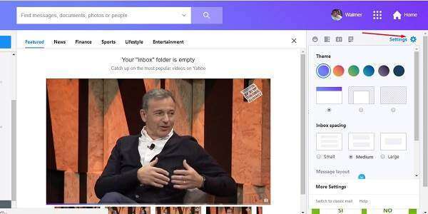
To begin with, in order to personalize Yahoo! Mail interface you to have to click on the setting button that is located on the right side of the screen, along with Yahoo Mail Messenger, contacts and calendar buttons. So, this button will show personalization parameters among which definitely stand out color and other personalized areas with your selection.

Of course, not only the colors can be personalized on the new interface, but other aspects like element distribution, mail sample design as visualization mode, and if it is wished use tab mode as well.
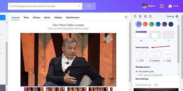
In the same way, you can select the mailbox spacing option right underneath the selection of color personalization areas in the interface. For example, available options are small, medium and large, which can be selected to take advantage of visualization screen size.

In another way, message design options allow to get message visualization on the side or underneath mailbox. Like this, this is useful if the visualized screen resolution is too wide or too long, being able to take advantage the most of it. However, if the resolution is too low message tab option is more useful, though.
In so, to activate this modifications you have to select one out of the three options in the message design area. Thus, options available are: No Preview Panel, Show Message to the Right and Show Message on the Bottom. Also, message tab option is a switch just underneath the available choices.

A more functional searching panel and user management
Continuing, the top bar regarding the whole interface has been simplified, having the same elements found on the older version, but it is shown in a simpler way now. So, the searching bar is now programmed to deliver priority on finding existing primary elements on the email.

In order to be able to use this searching bar, think about and write key words on what it is required and then click the searching button. On the other hand, if what you wish to search have some particular qualities, you can click on the complementary button with the pointing down arrow icon, in order to open the advanced searching options.

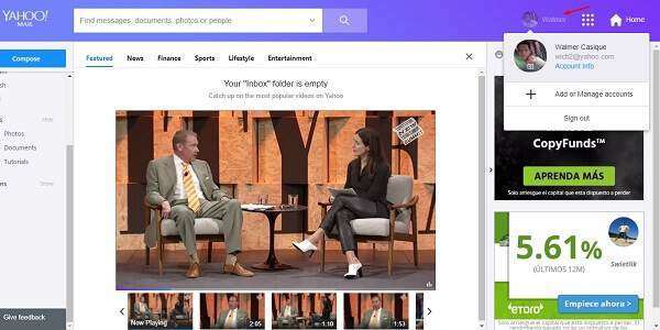
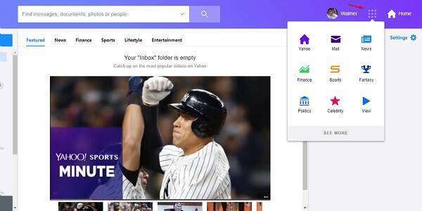
On another subject, account management options are now located to the right top of the screen. In details, management consists on: the user button, an access button directing other Yahoo Mail Services and a start button, which leads to Yahoo!´s home page.
In that way, to manage the accounts you just have to click the button with the user name on it, and then an emergent icon will appear to show information about the account with the logged session and options to add other several Yahoo! Accounts. In the same way, the session can be logged out from this option.

In order to access other Yahoo! Services as Yahoo! Sports or Yahoo! Finance, you have to click on the service button that opens an emerging menu, with links leading all these services. In so, to click on any of them will make you leave Yahoo Mail although the session will not be logged out.

Yahoo Mail access area to smarter files
The left panel has always been the one with access to predetermine email folders. In fact, the previous version of Yahoo Mail already combined smart folders with predetermine folders, but this time this function has been taken to a whole new level.
Regarding this, besides these links to smart folder other links are showed to visualize images only and attached documents that are contained on the emails, and last, there are the links to created folders in order to organize emails to own criteria, resulting on more neat and clean aspect.
Therefore, in order to use these functions it is just required clicking on the link of interest, if it is about an smart filter it will show email belonging only its corresponding definition, clicking on documents or images views and email visualization area will start loading a gallery, which will give access to multimedia elements such as photos, videos and others.

Of course, personalized folders can be modified at own will and if you want to hide them for personal preference, you can click on Hide, being this option reversible, as well.
Yahoo Mail goes on the right way, although it has to use the strategy on taking characteristics already invented by its competitors, but in this case it is a way to be able to modernize itself and become a competitive online email client.
